Our Wedding : Invitations & Handlettering
Welcome to part one of our blog series titled, Our Wedding. Over the next couple of weeks (or month or two- let's be honest), we'll be writing about each of our vendors and the team that it took to make our day so beautiful and us. In this first post, we're talking invitations and handlettering! Follow along on this process :)

We knew we wanted some type of floral element in our invitation suite and I thought that an envelope liner would be perfect. In enters my friend from college, Eleni. She is an amazing illustrator and I wanted to be able to hire her for something. She's just too good. We emailed her some of our inspiration images and she sent us some drafts. It was a pretty quick turn-around as we loved what she sketched out for us.
Here are some images from this process:


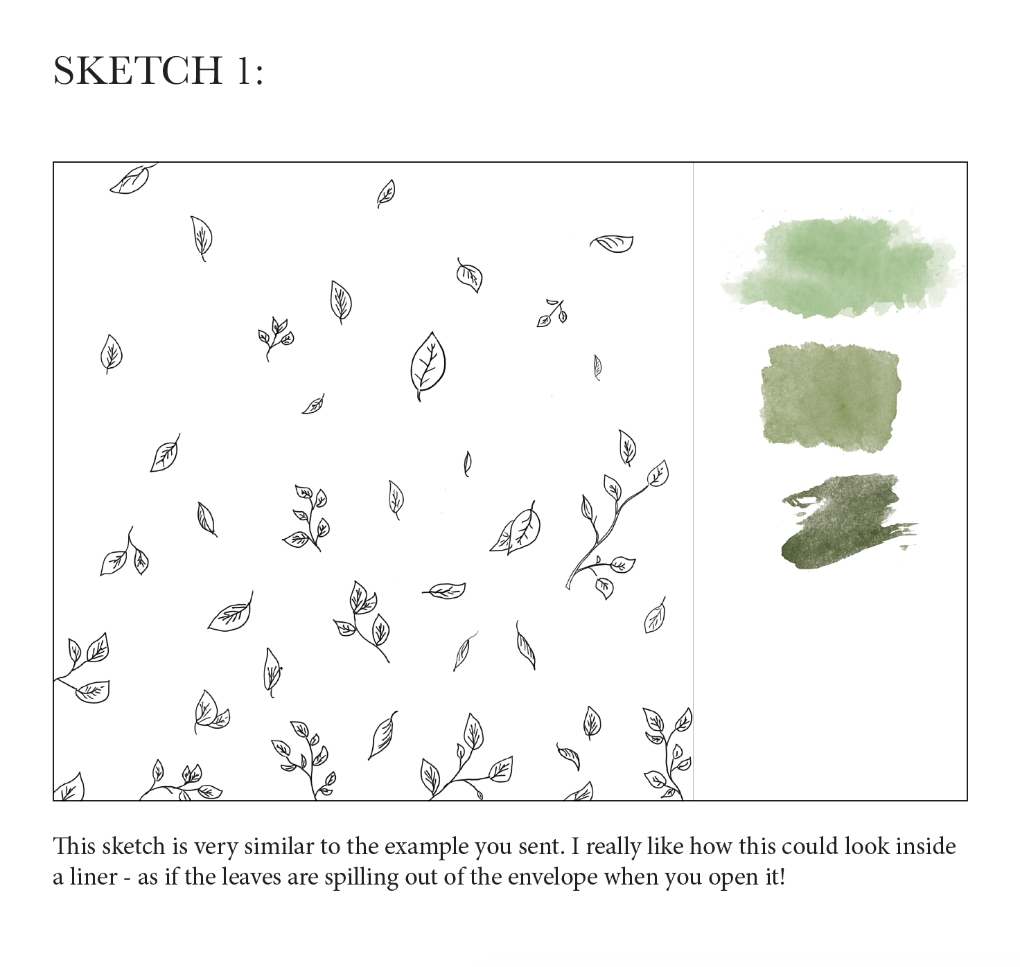
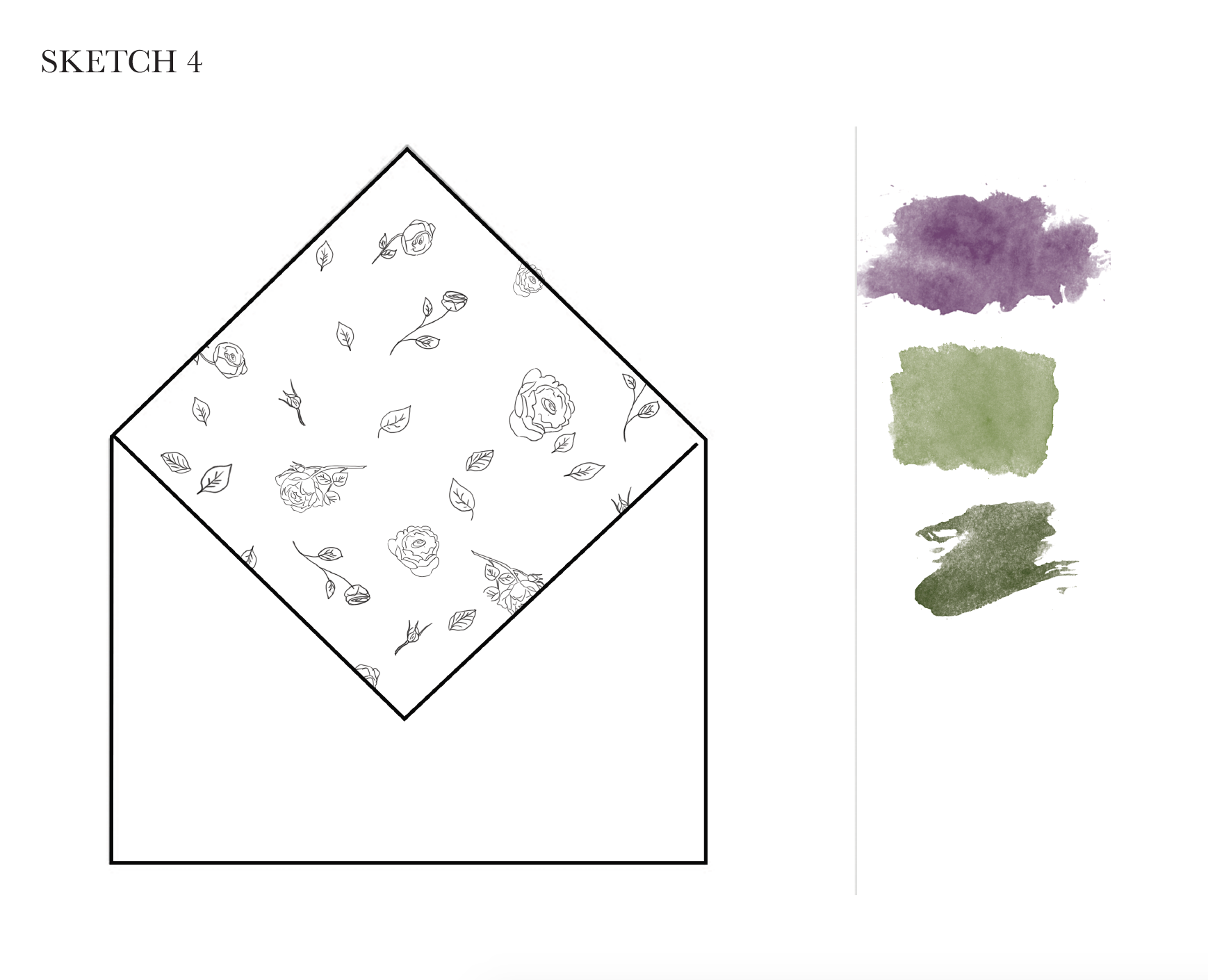

SKETCHES
Eleni sent us two concepts and we chose the one pictured here. She then finalized it with color.
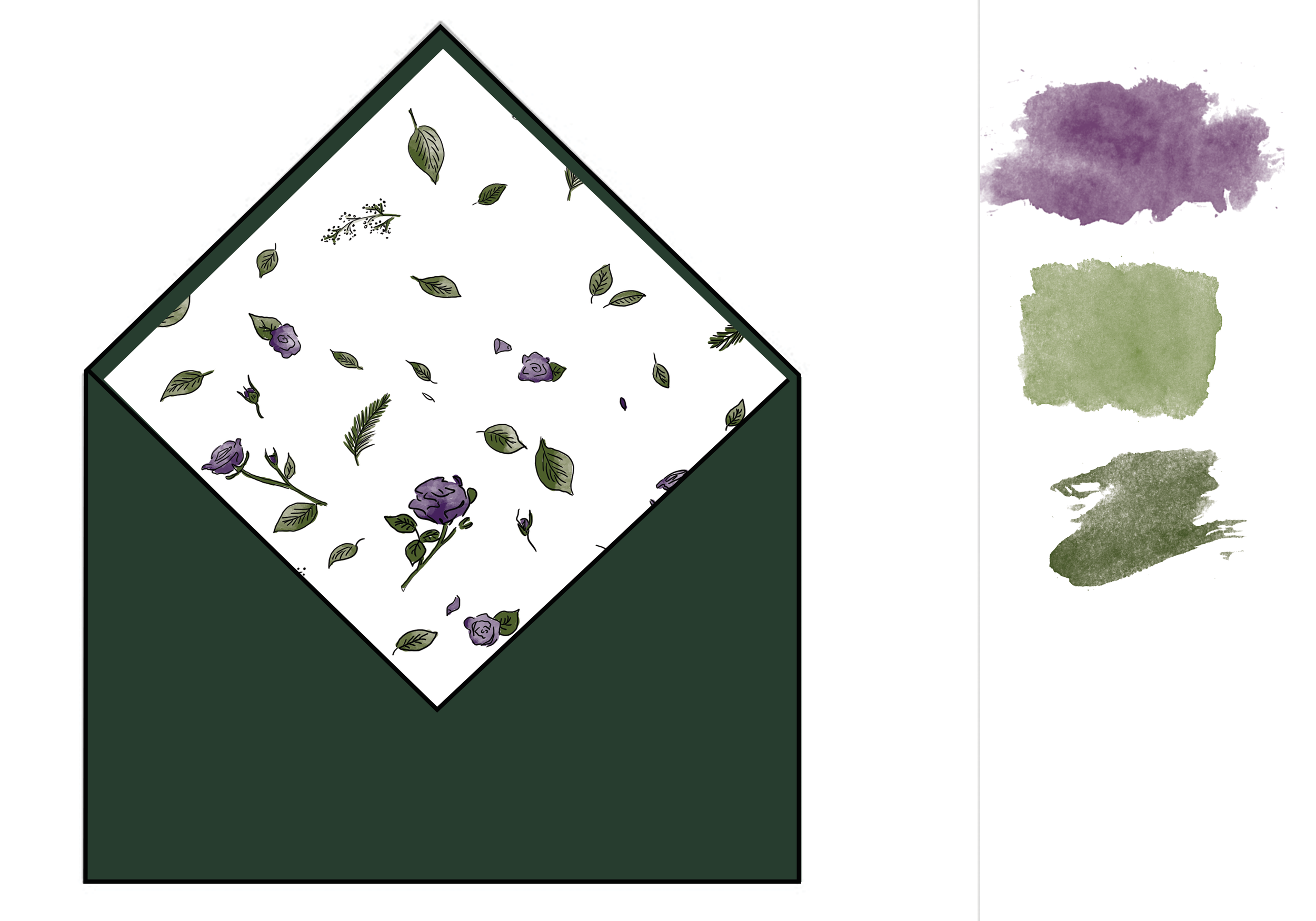
FINAL
Here's what they looked like prior to assembly!
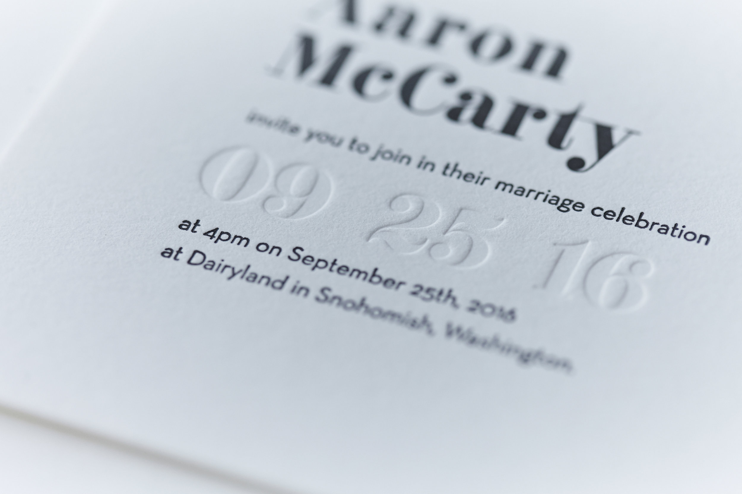
When it came to who would be designing and printing our invitations, there was no question. I interned for Sara back in 2013 and have since stayed connected with the business taking photos and working at their storefront. We always joked that she'd one day do my wedding invitations. I knew I wanted our invitations to be letterpress and on beautiful, thick paper. Sara did an awesome job encapsulating what we wanted for our invites because we wanted it to be able to timeless but modern. We didn't want anything that was 'trendy' per say, which is why we kept all illustrative elements outside of the invitation itself.
While I was finding inspiration for our invitations, I found the font F37 Bella. It's a beautiful font that is sophisticated with geometric elements.
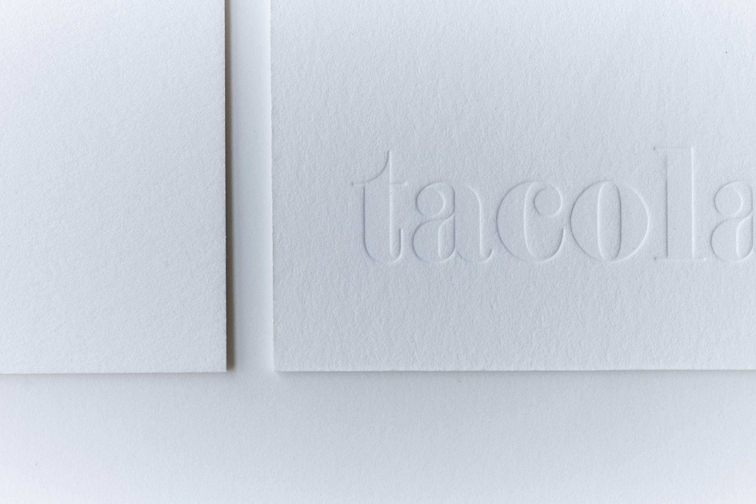
The main palette for our wedding colors were black and white, with touches of dark green, plum and burgundy. I loved the idea of keeping our invites simple in the colors and I wanted to incorporate blind letterpress so you could really feel the invites because of our thick paper.
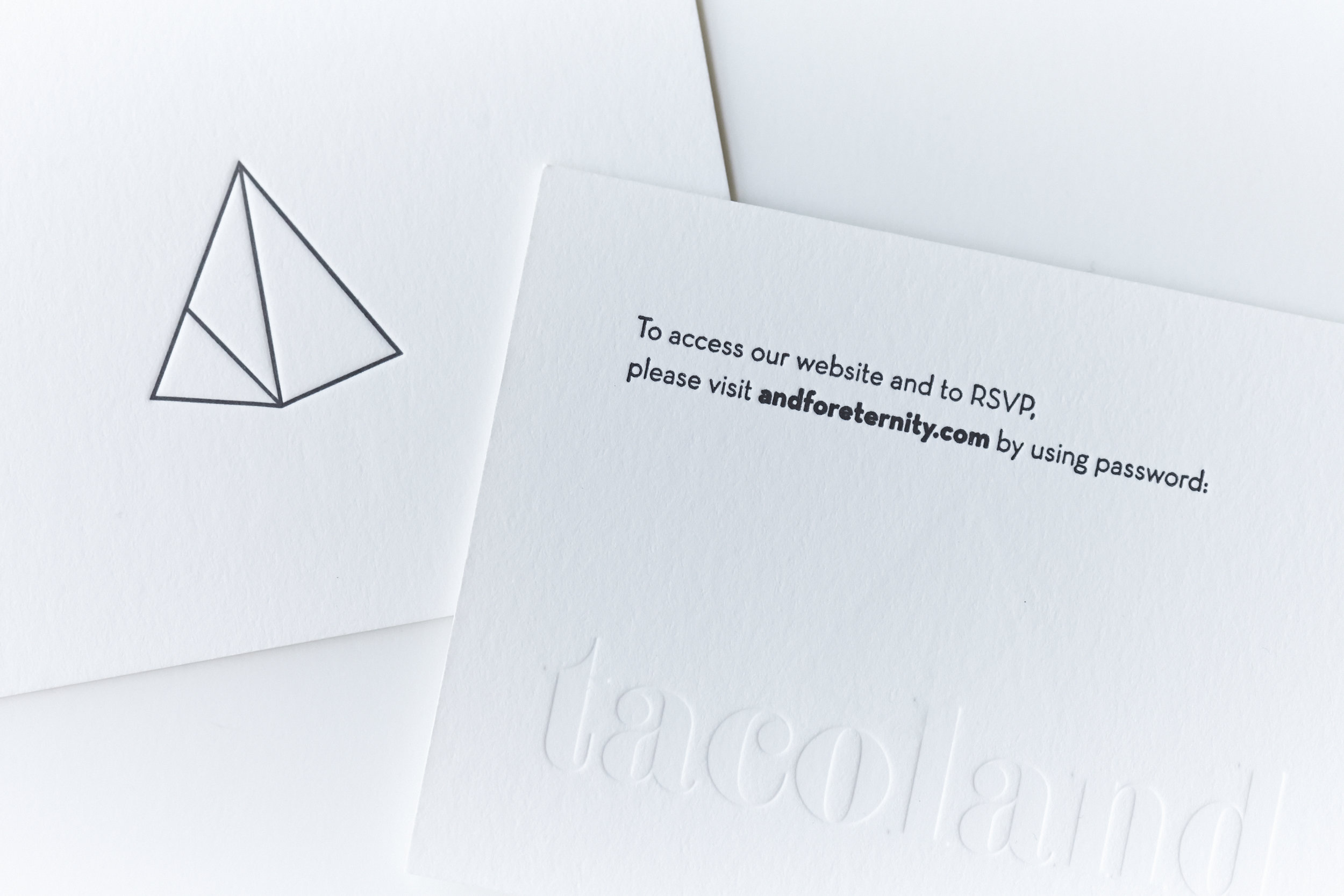
Our info card was a play on the idea as we had a password for our wedding website. The blind letterpressing made it almost like a password card.
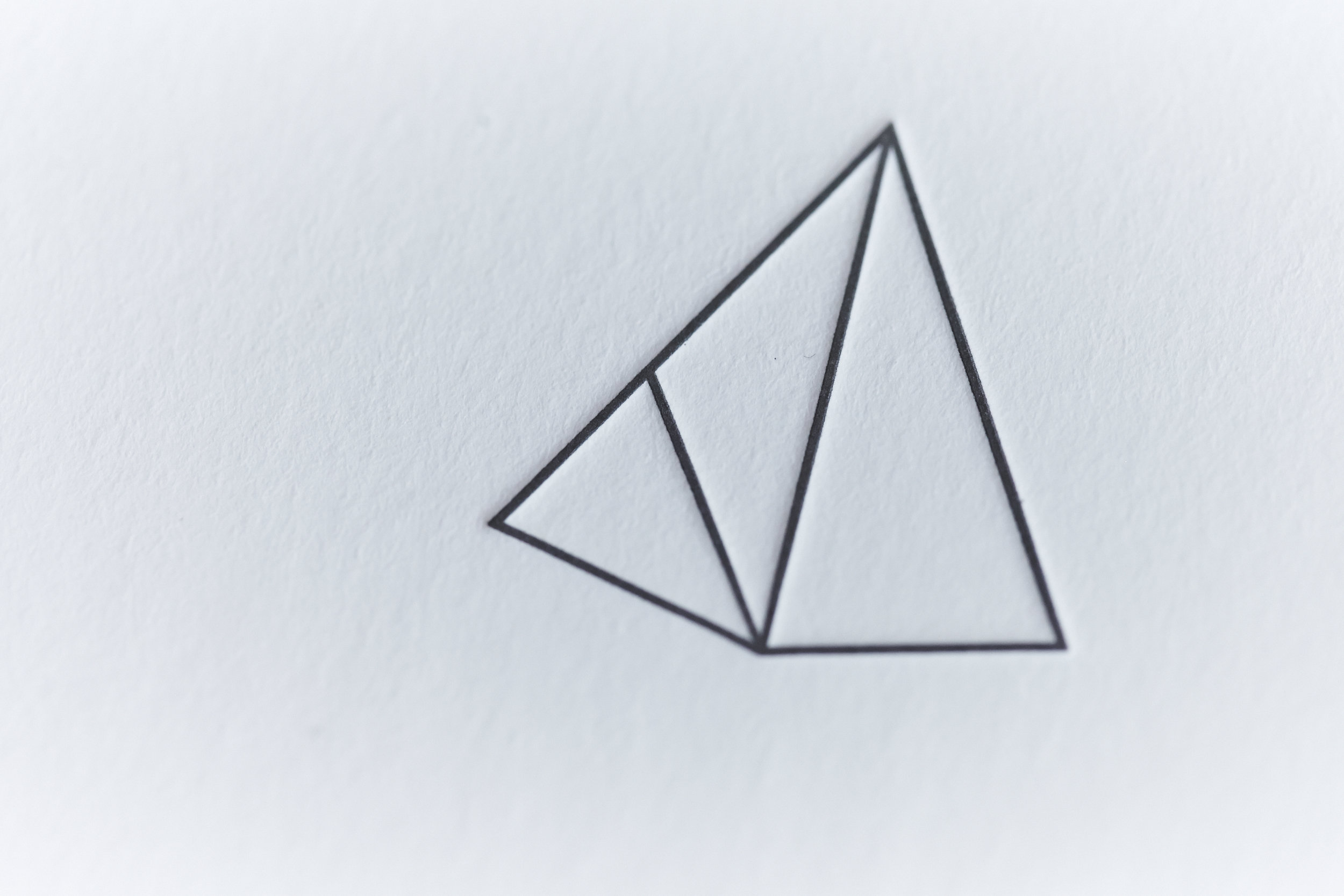
Aaron designed our logo! A triangular shape to represent our relationship with God. The left side is meant to look like an A and the right side is a D. He did a good job, right?!
Once we finalized our design, Aaron and I went into the shop and watched as Sara pressed all of our invites. I took photos of the whole process, but lost them since they had been stored on my stolen laptop. Huge bummer :(

I've been working part-time at Paper Source for over a year now and when the holidays come around, Paper Source comes out with holiday colors for their Paper Bar. I fell in love with Spruce as soon as I saw it. I wish it was a year-long color! Once the holidays are over, these envelopes are on super clearance. The standard size for invitations is A7 (5x7), but I went for A6 (4x6) instead because that's the only size we had left and it didn't make too much of a difference. I managed to buy 90 envelopes for about $9! To fill in the remaining envelopes we needed, I purchased black A6 too.
We also got a custom embosser through Paper Source since we were doing colored envelopes and I didn't want more work for Sara to letterpress our return address. I thought it was a fun idea since we were doing blind letterpress on our invites.


Aaron has a friend who is self-taught in calligraphy and once I saw her work, I was so excited. Ellen is super talented and in her particular field, I know that she'll go far. We hired her to address our envelopes and also our place cards! Aaron found some marble tiles from Lowes and Ellen used a permanent paint pen to write on 'em. They doubled as a party favor andddd they weren't too expensive!


The last element of our invitations were our stamps! Maybe I'm too detailed but I wanted the stamp to really pull everything together. I used some of the illustrations from Eleni and added an ampersand using the same font as our invite and ordered them from Zazzle. They turned out awesome and added just the right amount of color to the outside of our envelopes.

Final thoughts? Invitations set the tone of your wedding since they're most likely the first thing your guests see regarding your wedding. I always thought I'd want to design my own invitations and do this all myself, but I am so glad I had someone else help! Obviously I am a little bias because I have a graphic design background, but the details matter to me. Details like paper type, envelopes, stamps, etc. We wanted a beautiful look to our day, but also not too serious. I mean, if you know me and Aaron, we like to have sophisticated fun. Is that a thing? I mean if having tacoland as the password to our wedding website didn't clue someone in... :) Hope you enjoyed reading!